Stock markets do not reflect the economy. Or do they?
Investors know that stock markets rarely function as a direct mirror of a given economy. How can we get a feel whether markets are reasonably priced or not? Let's explore.
Paul
5/21/20255 min read


Stock Markets do not reflect the economy. Or do they ?
Introduction
It is often said that stock markets and the economy are not really connected. It is even very well possible that a given event, like an interest rate hike, has the opposite effect on the market than what one may logically expect. In such circumstances, experts usually are quick to point out that the event was already “priced in”. The million dollar question is how we can know if a market and its pricing reflects what is going on in the economy, if pricing is reasonable?
The idea of this blog post is to explore a few tools that help us to evaluate if a market (or stock) is reasonably priced. As someone said, it is better to buy a great company for a reasonable price than the other way round. Let us explore a few tools that can lend us a hand, and start from micro (company) working up to macro level.
P/E Ratios
A first and basic indicator is the PE ratio of a company. You simply take the latest price (P) of a stock and just divide by the last known earnings per share (E). This is a rule of thumb type indicator telling you if a stock price is low or not, but it comes with a few caveats. If a PE is very low, there may be reasons for that, and this may even be a sign that a company is not in very good financial health. And inversely, tech companies may have a very high PE because investors believe there is much growth to come in the years ahead. In any case, make sure other indicators like the Debt/Equity ratio and Price-to-Book ratio are healthy. But these tools are on individual share level, and from here on we will apply the PE approach to markets by looking into indexes.
It is important to realize that the perception of what is considered a reasonable PE has changed very much over the past few decades. Forty years ago, a PE of 10 to 12 was considered normal, and investors were scared to financial death by Japanese companies that posted PE’s at or above 20 at the time. Today, such levels seem to have become the "new normal". How the tables have turned.
Let this sink in: a PE of 20 means that a company needs to maintain the same earnings during 20 years to cover the stock price. That is double the time of what was normal a few decades ago. To give you a feel of today’s average PE of 2 markets: the DOW 30 sits at 25.72 (excluding Boeing), and the Stoxx 50 index at 24.79 (excluding Safran).
Sky-high if you ask me, so a 10% to 20% market correction really is nothing, as a certain Warren Buffet said not so long ago. Who am I to contest that?
The Schiller PE Ratio
Also known as CAPE (Cyclically Adjusted Price to Earnings ratio), this takes the concept of the PE ratio next level by applying it to a market (SP500 index) as a whole.
The Shiller PER is calculated by dividing market capitalization by the average net income over 10 years, adjusted for inflation. At the time of writing (May 21, 2025) the Schiller PE Ratio of the SP500 stood at a whopping 36.51 – hardly a bargain I’d say. You can check this out daily on the following link:
https://www.multpl.com/shiller-pe
The Buffet indicator
Another great tool to check is the Buffet indicator. This indicator shows whether markets are undervalued or overvalued according to Buffet’s philosophy and observations. The formula is very simple: the Buffet ratio = Total US Stock Market Value / USA Gross Domestic Product (GDP)
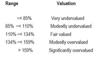
As of March 31, 2025, the Buffet indicator stood at 59.10 trillion USD/29.51 trillion USD = 200%. To translate that figure into normal language, here is the table you need to interpret the figures:
Knowing that the Buffet indicator stands at 198% at the time of writing (May21, 2025), it should not reallly come as a surprise that Mr. Buffet (Berkshire Hathaway) is sitting on a huge mountain of cash, for the moment not really investing given the lack of real fair value opportunities...
You can find this value each day on the following link:
https://www.longtermtrends.net/market-cap-to-gdp-the-buffett-indicator/
CNN Fear & Greed index
Another principle Buffet adheres to is to “buy when others are fearful and sell when others are greedy”. The logic behind it is that fear drives down prices, whereas greed drives up prices. There is something to say for that, but how on earth can an average investor get an idea of what the market sentiment is in a given period?
That is where the CNN Fear & Greed index comes in, which you can access here: https://edition.cnn.com/markets/fear-and-greed
At present this indicator clearly is in the greed territory, and only just a month ago we were still in the "extreme fear" league. This is a clear demonstration of what uncertainty can do to markets, no matter what triggers that uncertainty.

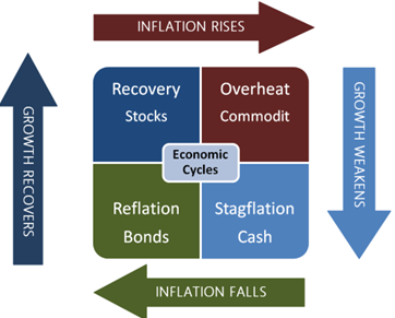
Asset Allocations driven by the Economic Clock Principle (ECP).
At this website you can check daily asset allocations in the Asset Allocation dropdown menu. The asset allocation grid suggestions are derived from the above mentioned principle incorporating 1-year forward looking GDP growth and inflation trend estimates of a given country. This is yet another approach establishing a link between (macro) economy and financial markets.
The underlying rationale is that certain asset classes tend to do better than their peers in a given point of an economic cycle, which provides us with an indication as to which asset class you may want to be invested in for the coming year. Four asset classes are considered: cash and assimilated, bonds (alias fixed income), shares (alias stocks alias equity) and last but not least we have commodities. If you look into these asset allocations from time to time, you will notice shifts in suggested asset classes, into or away from stocks for instance.
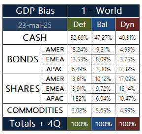
At the time of writing the following asset allocation grid was suggested for a non-biased geographical weighting where each country keeps its own GDP as reference. The result:
No matter what investor profile you look at, there is a very large suggested percentage allocated to cash or assimilated (short term treasuries for instance). Add lower risk fixed income to the equation and then we are looking at very high cash and bond percentages.
Even the more aggressive "Dynamic" investment profile is supposed to have more 50% of the portfolio set aside in cash and fixed income with “just” 43.7% (17.09 + 16.14 + 10.47) in equity. Since a "Dynamic" profile is focused on stock markets we can use this to get a feel how the wind is blowing for stock markets.


CONCLUDING
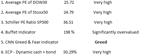
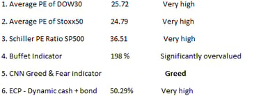
Now, putting all this together we set up a table that paints a broader picture:
I do not know about you, but looking at these 6 indicators, it seems to me they give a very clear signal that current markets are very, very expensive. Translate the word “greed” into FOMO (Fear Of Missing Out) and maybe that is exactly what is driving the markets right now.
This makes me think a bit of a cartoon which said "Buy now, you can always panic later". Bad advice. Citing Buffet once again, a correction of 10 to 20 percent is nothing really, so it should not be a surprise if and when it happens.
Invest wisely and stay curious!
MY INVESTMENT ASSISTANT
IMPORTANT INFORMATION
Subscribe and get a free quickstart and clickable financial website list pdf
Empowering Investors with tools